So what seems like months since I started this powder room project (well it has been). I am so very glad to announce that this little itty bitty space is finally finished.
The vision that I had for this room was a little bit pretty, or a lot. I so desperately wanted to create a modern, vintage look with a bit of glam all in one room. I think sometimes a room doesn’t have to be all ONE type of design. This was my chance to make it how ever I wanted it to feel.
So this is the start of my journey with this little room that took a lot of my time. But in the end, I am so glad that I stuck with it amongst a busy schedule. I have to say that I am truly needing a break from my paint brush… and white paint for that matter. There is a lot of white in this room, but oh the brightness that the white has created!!
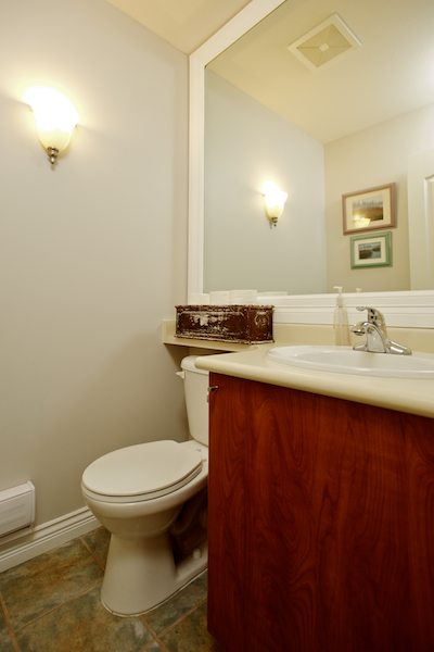
Do I even dare to show you the BEFORE picture? Of course I will, as it always make the after look so much better!!
These are the obvious “wrong” things about this room.
- The floor tiles are so wrong!! They are the same ones that the builder installed here.
- The cabinets that came with the original house were a orangey brown color that I have disliked for years now.
- For starters we weren’t even using the cabinet for very much. Storage was never an issue in the space, so I as able to find places for the towels, plunger, etc. that used to be stored in the cabinet.
- There needed to be some life on the walls, and general better feeling in this space.
So here is what got accomplished in the new space:
- We removed the toilet and existing cabinet so we could install the hexagon shaped tile.
- covered three of the walls with a cedar tongue and groove paneling.
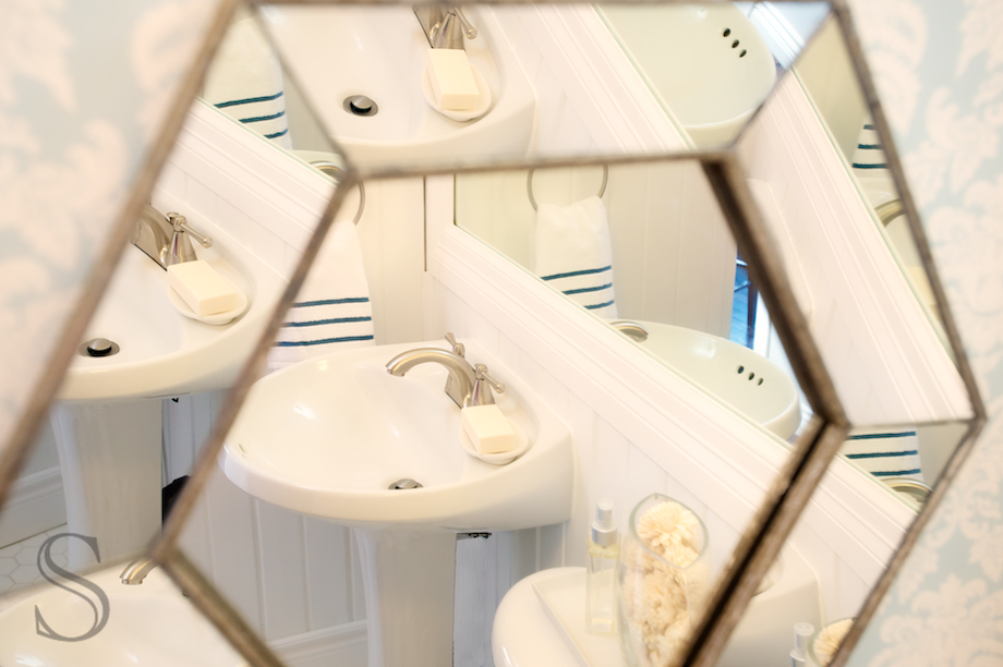
- I added a gallery of mirrors.
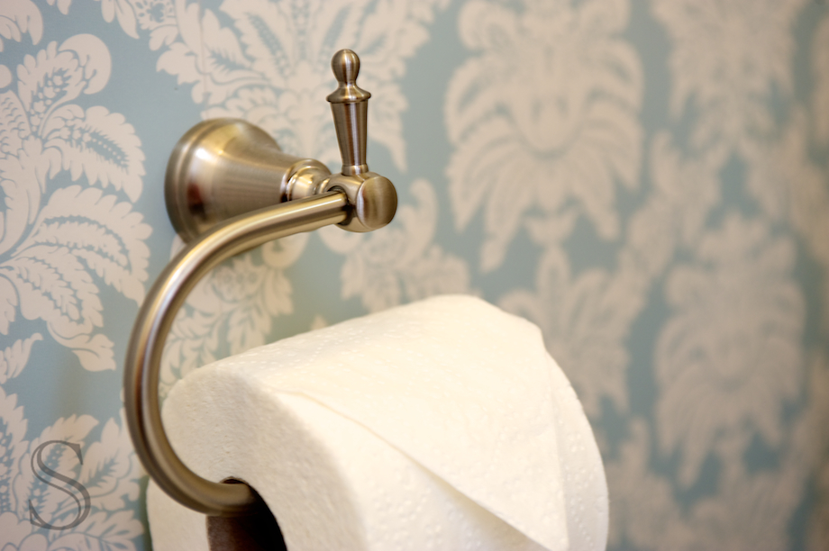
- changed out the old taps for new taps and a new toilet paper holder.
- covered the main focal wall with wallpaper.
- added crown molding to the ceiling.
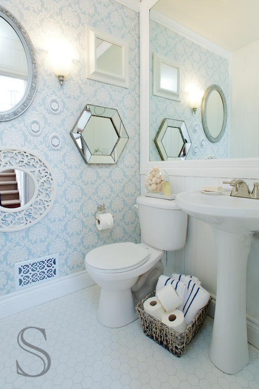
I am very happy to show you the AFTER photo of this space. Once again I recruited my husband Darryl (DarrylBueckert.com) photos to shoot this project. This little powder room doesn’t receive any natural light so I needed a professional to light it. While I could have taken some shots to show you this space, but it’s not my favorite thing to do.
The jumping point for this room was definitely the wall paper. This room was calling for some personality. I think the wallpaper gave it just that without being too much. I decided to do a gallery of mirrors on this main wall, and this gallery of mirrors I came up with adds so much brightness when you are standing in this space. I love how it turned out, and worth every penny I spent on it. This wall now looks, pretty and glamorous with a modern vintage feel.
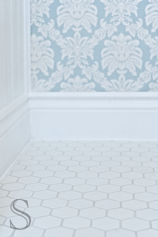
We have paneling in our kitchen so I wanted to echo that in this space as well. The room has a traditional feel when you are in it, so I really wanted to maintain that wood from floor to ceiling look. I really think it adds dimension to the walls, and obviously extra light to bounce off the large mirror that we framed a few years ago. Go big or GO HOME!! I chose a hexagon shaped tile to represent more of a vintage style bathroom. I love the tile so much. I think a lot of people would be afraid of installing a white tile in a bathroom because of dirt, etc. but I think it then keeps me more accountable to keep it clean. Just because you can’t see the dirt doesn’t mean that it isn’t there. I would rather see dirt and take care of it, instead of sweep it under the rug.
We purchased the pedestal sink off the wonderful, glorious Craigslist… The price tag? $40.00. This sink is in such good condition, I can hardly belive I paid so little. This sink sits a mere 19 ” away from the wall, so it is perfect for this small space. How did we ever live with that huge, large cabinet?
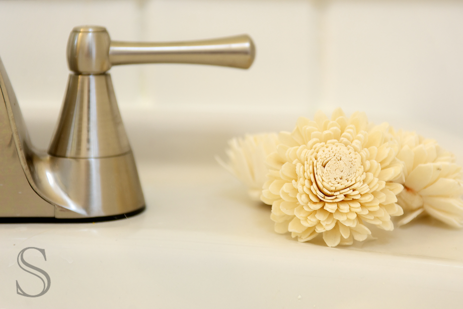
We had some existing taps that we purchased a few years ago for the “future” ensuite bathroom that we plan on doing one of these decades. We aren’t planning on doing this major project for quite some time, so these taps might as well be put to good use. The bonus is that they go perfect in this space. They are modern, streamline, and have that look I was after.
Well that’s the quick low down on the space that I created. I love it’s freshness and vibrancy everytime I walk into this room!

WOW!! Jodi….it looks amazing!!! I love everything about your new powder room! The wallpaper is perfect….not too bold (because of the soft colour), but so girly and gorgeous! The room looks so much bigger now too! I love what you’ve done with the gallery wall of mirrors. It definitely opens up that wall. I love how mirrors do that 🙂 I’m sure it feels so great to have it finished! We’re halfway through our downstairs bathroom reno right now (trying to get it all done in a week is really hard….we have relatives coming to stay on wednesday!), but at least it’s forcing us to get it done! Nothing like a deadline 😉
Thanks Tracey, thanks for the kinds words. I love it too! Good luck with your project. I can’t tell you how manny times we have done a project right before guest arrive. You will get it done…. Keep at it!
oh it looks fantastic!! love the tile you picked and the colour is so bright and fresh. i love it!
Thanks Robyn, I love the tile too. Thanks for the kind comment.
Jodi,
Your powder room looks even more gorgeous now since I used it last week! You put some finishing touches in there that just tie it all together. My favourite part is the creative and eclectic wall of mirrors. Beautiful work. I love this post with all its detailed shots.
Thanks Carly. I am so happy the way it came together…
Wow! Love it.! It flows perfectly with the rest of your home and it looks so much bigger. Simply beautiful!
Thanks, I love it too!
WOW! Looks AMAZING Jodi. Love the wallpaper, mirrors and hexagonal shaped tiles! Fantastic!
Thanks Barbara! I love it too, but this little room was sure a lot of work. It’s all those details right?
You’ & Darryl have done a fantastic job in this space, Jodi!! While I love the overall look & feel, especially the walpaper(!), I think my favourite thing in the room is your mirror wall montage. Brings a special, eclectic energy to the space! I’m kicking around the idea of marble hex tile for our upstairs bathroom (which we’ll tackle once the basement bathroom is finished – yep: we’re reno obsessed!)… I hope I can find what I’m looking for when the time comes!
Victoria
Thanks Victoria, I love it now that’s done. I love the tiles too, it really brings the space together,
I know all about reno obsession. We are 6 years into our house and probably 30 major renos done later. Sometimes it’s hard to know when to stop. In your case, you must continue if the house is older.
Happy renos!!!
Jodi
Great job Jodi! That is quite a transformation. You must be so thrilled.
Thanks Carol, I am so glad it’s done.
Beautiful! Thank you for sharing this link with me 🙂 I love your wall paper and the flooring is to die for.
xo
You’ve taken a basic bathroom and made it really beautiful. So bright and fresh now. Lovely job Jodi!
Thanks Nyla. I so appreciate the kind words.
Oh my Goodness… this is absolutely stunning! I love the wallpaper, the tiles and the mirrors. You are so talented!
Lindsay
Thanks so much. It’s nice to meet you. I’ll have to take a look at your’s now!
Just stunning – gorgeous too! I linked this to my bathrooms post as well, please come on by and take a peek!
Jodi, the bathroom looks so beautiful. Great job! You have a great talent! Thanks for sharing.
Oooo, I love it!