I’ve been working on a custom designed fireplace and built ins for some clients for most of the spring and summer, and thought that I would show you the first ideas on Paper before I bring in Darryl to photograph the space.
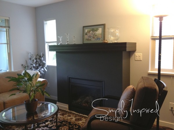
This is mantle surround as of a this past spring… Pretty dark, and a heavy presence.

This is where the mantle started at… For the tightness of the space, and the much-needed light in this part of their home I thought this mantle was just too over powering. My clients agreed when I discussed a redesign of this area in their home. They both like to relax and watch TV, read, or hang out in their home with their grown kids who frequently visit with the Grand babies…
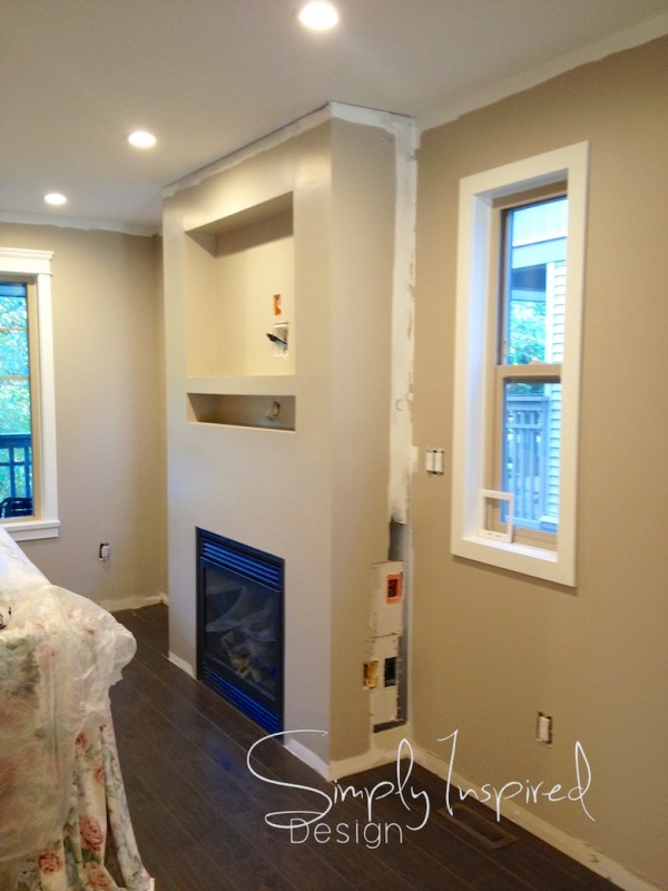
Then with a little work from the Trades, we got to this…. but still lots more to go!!!

The mantle is prepped and waiting for the added customization, and I think it looks pretty good even at this state. With the heavy black mantle gone, this couple can finally breath in this space.
That mantle gave the eye nowhere to go.. only to stay right in the middle of the room, so I felt it was very important to create a mantle design that lifted the eye up and beyond. With the help of the crown molding, the eye continues up even more. I’m excited to see the finished product when it’s all installed.
I enlisted Duane from Out of Line Designs to build the Custom cabinets that flank the fireplace. I chose to work with Duane for his eye for detail, his love for All things WOOD. The provides great experience to his clients, and not to mention he’s just a great guy all around. One thing that we both agree on is that for something to be great, you must think outside the box. Duane is always up for a challenge that way, and I appreciate that about him.
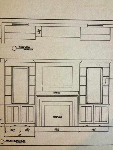
These are the plans for this wall

With the small windows on either side of the fireplace not contributing or providing a lot of the light for this space, instead of trying to ignore them I decided to build my design around them. This will allow the windows to blend seamlessly as one whole unit and truly allow the fireplace to be the focal point for their living room.
This area of their home is ONE of the first areas that you view when you walk into their main living space, so it was so important that I create a WOW moment when you walk into their home, but still the design provides the practical or intentional design to it.
I’ll make sure that the mantle gets photographed when a few details are finished, but for now this happy couple is enjoying every minute for their new space of luxury.
Jodi
It’s looking better already. I like how you’ve blended the windows into the design. It will be a WOW wall for sure!
Thanks Meesh! The windows realy look good now! I know this becuase I’ve seen the finished product!
I can’t wait to see more, Jodi, because I’m really liking what you’ve done so far. Love, love the way you’ve integrated the windows into the design!
Thanks Sheila, we probably wont be able to get in to shoot the space till after the new year! Stay tuned..