This is part of a message in my inbox a few weeks back. Everyone in the design world knows that Ikea Rocks and they are changing the way design can look and be affordable for most families today!
Congrats IKEA!
——————————————————
January 29, 2013
News Release
For Immediate Release
IKEA Design Wins Gold at the 2013 Interior Design Show
Judge Inspired by IKEA’s “monumental and domestic” design this past weekend
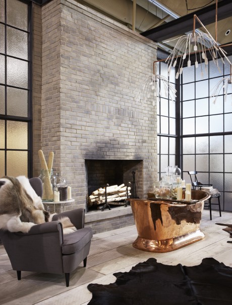
Burlington, Ontario – IKEA Canada’s inspirational kitchen and bathroom design wowed the crowds at this year’s Interior Design Show and clearly impressed judge Donald Chong of Williamson Chong Architects, who awarded the home furnishings giant with a Gold Booth Award. The design featured IKEA products mixed with antique elements, encased in warehouse windows, an exposed brick wall and a grand fireplace that created a rich and eclectic design.
—————————————————

“Scandinavian design is at the forefront right now and it only makes sense for IKEA to own this expression.” Says Madeleine Löwenborg-Frick, Public Relations Manager, IKEA Canada. “Our design showcased the rustic, industrial side of Scandinavian design reminiscent of the converted warehouse spaces in Copenhagen that are so trendy right now; rather than focusing on a predictable mid-century modern expression.”

“The IKEA booth showed that even a so-called ‘larger’ company can indeed display a level of care and craft to the interior environment.” says judge, Donald Chong. “The design of the booth was memorable for the fact that it had the intent of creating a space both monumental and domestic in scale — something that registered well for a design show, but also that registered well with a more discerning public interested in spaces that have good value, performance and, still, a good feel.”
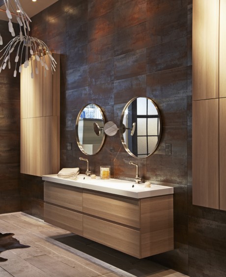
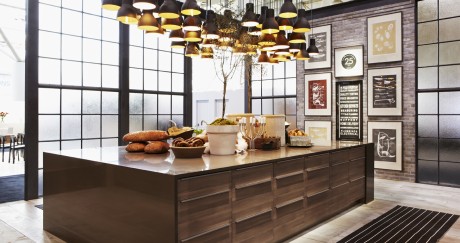
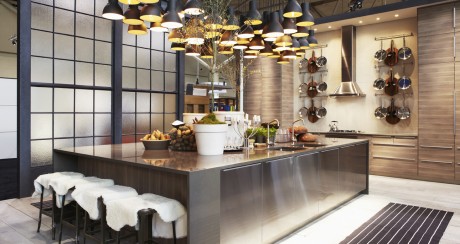
Inspired by the signature blond wood of Scandinavian style, the booth featured the company’s newest offer of SOFIELUND light grey walnut kitchen doors and the GODMORGON white-stained oak bathroom cabinets. Both rooms were presented on an exaggerated scale that showcased the flexibility of the range and created desire in show goers.


About IKEA
IKEA is a leading home furnishings retailer with 325 stores in 40 countries worldwide, which are visited by 734 million people every year. IKEA Canada has 12 stores which are visited by over 25 million people every year. Last year theIKEA.com websites attracted over 1 billion visitors. Founded in 1943, IKEA’s business philosophy is to offer a wide range of products of good design and function at prices so low, the majority of people can afford them. For more information on IKEA, please visit: www.IKEA.ca.
Pretty stunning right?
Jodi